Some of the christmas card designs I've been working on for friends and family. They're all getting to keep the originals the lucky devils!
Wednesday, 22 December 2010
Thursday, 9 December 2010
Graduated.
So as you can see here, last week, I graduated! (look, I've got the hat and everything). I'm not looking drastically flattering here as I was immensely hungover for the event which was ludicrously early in the morning. Hungover Alex? for one of the biggest events of your life? Yes. Yes I was! know why? Go out the way you went in, thats what I figured!
I'll take this moment to mention some politically relevant stuff: I sympathize deeply to all potential university students out there whose lives (and more specifically, bank accounts) are to take something of a bashing in the future, for no real gain or purpose that I can see... Its a difficult conundrum, University was the most fun time of my life and has significantly made me the person I am today, as well as given me the drive to strive for more from my life. I would urge anyone who felt an interest in gaining more academically to go to uni. It will be the best days of your life. But at the same time, I could not justify playing ball with the government, caving in and actually paying the costs they expect you to pay. I am glad I don't have to make this decision, I am lucky in a sense. But I am by no means complacent, I fully support the protests by the students and wish them luck and support. For the sake of the country, we need a generation of people like that.
Wednesday, 8 December 2010
Tat Design
A little political relevancy.
I doubt they will, but its always a possibility. What a crazy world we live in. Maybe I'll print this postcard and send it, then I'll have done something I guess...
oh also, the last image is to show them as postcards, otherwise they just look like simple pictures. Perhaps I need to work on my mockup skills, as I don't think I got the angles of a convincing piece of card on a table surface correct. If you dislike that though, that is what we call "nit-picking".
Sorry about the lack of posts you 7 people that actually follow my blog... although you probably don't really do you?
anyone?
no.
ok then.
Sunday, 28 November 2010
Monday, 15 November 2010
Alex Ball
"Fatal" exception error
Friday, 12 November 2010
today's really good bad idea
Wednesday, 10 November 2010
The World Of The Future
You too could live this dream. Email me at: Alexanderlucas@live.co.uk
(plug bit out of the way)
made this little thing to stick on my website to advertise that I make websites too. Gonna build a seperate little popout bit for my website that explains about my webdesign, mainly because adding it as a section to the website as it is would require overhauling the whole nav. bar at the top, which a) I don't want to do. And b) would make it look too messy in my opinion.
Been also toying with the idea of sticking a photography section in in some sly way too... but that'll be after the web bit. We'll see.
Monday, 8 November 2010
thanks death cab
Its unimaginable just how many times i've listened to the narrow stairs album in the last week. I don't do fanart, but apparently I just did, lets call it a homage to my very creative process in general, which has been pretty much fuelled by listening to death cab for cutie's albums over and over in the last few years.
I like the idea of clashing colour spectrums, might try that some more, I do love discovering something I like the look of by just doing this sort of mess around posters for no real reason at 1am.
Side note: will start posting more reguarly, promise!
(Slight edit: after I did this and posted it, changed it to the one with the texture without feathers... think i prefer it without, also a bit of practice giving things old poster texture, learnt a new method, gave it a go, looks pretty alright, getting there anyway).
Wednesday, 3 November 2010
A misleading joke about legs
Monday, 20 September 2010
Saturday, 18 September 2010
Monday, 23 August 2010
Thursday, 19 August 2010
Beyond The Sea
Wednesday, 11 August 2010
The cards
So, with The Loose Girls upcoming album, which will be a limited run of 52. Each album will come with a small poster (in progress) and a limited edition loose girls playing card (52 cards in a deck, 52 copies of the album) means one of each card. Holy collectables Batman! that's gonna be pretty sweet.
So heres my first concept for the card backs (haven't started the fronts yet).
Tuesday, 10 August 2010
The Loose Girls
Friday, 6 August 2010
The Clothes Off Routine
Another potential poster for the band The Clothes Off Routine, I'll be throwing together a load of these to show the band and see what they think. Might be working on the EP artwork too.
like the other one, visit: http://www.alexander-lucas.com/poster2.pdf for a high high res version).
The Clothes Off Routine
Poster for the underground 'sexy rock' band "The Clothes Off Routine".
(Just like to point out, I just uploaded this and it looks awful in jpeg, the pdf looks beautiful and crisp. if you want to see that, visit: http://www.alexander-lucas.com/theclothesoffroutine.pdf)
Wednesday, 4 August 2010
Monday, 2 August 2010
Saturday, 31 July 2010
Friday, 30 July 2010
Dirty Sexy Woman
Thursday, 29 July 2010
Pirate Cave WIP - Started photoshopping.
Heres a little section of the piece that I've done so far. Things still need a bit of work, the rest of the image is maybe halfway through shading, maybe not even that. I'm pretty happy with the way this has come out so far though. The water texture will be changed to something that fits better... in fact the whole image was going to rely on textures, but I'm not sure thats a good idea anymore.
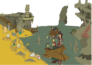
We'll see.
I've used a lot more layers than I usually do, for detail and lighting, the lighting is something I'm pretty happy with, as well as the white lines in the water which are my favourite bits so far, little things like this are adding more depth than my previous work has, which i'm very happy with!
Tuesday, 13 July 2010
Pirate Cove wip - block colour
Stage 2 of my working process. Using adobe illustrator I've live traced my scanned line work so its now a vector. I've then spent a very long time using the paint bucket tool and live paint to colour everything. Sometimes there are gaps, and it is VERY annoying... it takes a while to adjust those.
You'll notice the missing background, I'll use photoshop to fill that in with texture, same goes for the big areas of block gold.
Next stage is to shade EVERYTHING with 2 layers of darken and 1 lighten using photoshop... I'll update as and when It looks worth updating, but that stage could take me a good 15 hours continuous work... which I don't have the luxury of at the moment, due to working an AWFUL minimum wage job. I reckon maybe a few days though.
Monday, 12 July 2010
Pirate Cover wip - line work
I've never really shown how my work gets done, so with my newest photoshop piece, I'll upload it at various stages of its readiness.
This is the linework pre-vector. I draw it all by hand with my trusty 3H pencil, then with the steadiest hand I can muster, I use my beautiful .25 Rotring ink pen to line it, ideally leaving as few gaps in the lines as possible (although I've started to think It's impossible to not get a single gap).
The grey mess in the middle is where I've merged two scans, I draw A3, but only have an A4 scanner, so I have to a lot of jigsaw piecing things together, which is a monumental pain in the ass.
Next stage will be to vector the lines, and block colour the whole image.
Watch this space to see how that turns out (probably tomorrow as I've got to get ready for work in a minute)
Sweeter times.
Cinema Graphics
Did a bit of graphics design stuff for a friend on the Digital Film Production course at the Uni of Gloucestershire. Was pretty good actually, I've always toyed with the idea of doing a bit of graphics, and I enjoyed this. Tried to give the cover and some parts of the interior a sort of 50's Deco cinema feel. The actually book looks really nice, my scanner didn't do the best of jobs, but you get the idea.
Sunday, 20 June 2010
Bit of Grafitti
Done a few little grafitti works about my campus recently... almost got into trouble for a few of them, so naturally my tutors asked if i could do a piece for our degree show. wonderful i said! more of my work on display, and why the devil not!
expect some photos of the other things i've got away with to surface soon.
Saturday, 12 June 2010
Tiki
Here's what you've all been waiting for right? A new photoshop piece by me...
Well, I did this piece for an exhibition in London that starts this monday (14th June 2010) at some design studio in Tottenham Court Road, if you're in London, go check it out.
Either way, I'm quite happy with this, I did it in one day, probably 8 hours worth of working, a LOT of photoshop unexpectedly quitting and Red Dead being played next to me the whole time.
This will mark the first time I've added figures into this work... It's done two things in my opinion: Firstly, Its given the work much more of a narrative quality, a bit of humour and movement. BUT Its also killed the quiet, environment, design quality that the other pieces had. The focus on the place and the statues, the environment design that I loved about the others is gone. I need to find a way of merging the two.
Oh, side note, Uni's over, I finished, graduated, 2:1 I think. Time to find a job and crack on with this kind of work for the rest of my days I guess!
Saturday, 29 May 2010
Wednesday, 26 May 2010
Another new thing trial
Well, whilst I'm obviously only now trying new stuff (not clever Alex!) This is kind of a combination of the watercolour stuff and the ink stuff I'm so used to doing.
Not sure what to think, I quite like them I guess... I'm gonna try some more but with less childrens book style drawings, something either darker and more macabre, or more realistic... So check back soon!
Monday, 24 May 2010
Saturday, 8 May 2010
Travellers Tales 1
Ok, so those pencil things I did, well, I did them on too small a scale in my opinion, so i've done a new one A2 size, and I'll obviously shrink it down.
I'm not gonna write much about it because its 4am, i'm REALLY tired, and i just spent AGES scanning in 7 different sections of this and lining them up on photoshop in order to have it on a computer. effort.
the more i look at it, the less happy i am with it... but i am incomprehensibly tired. so i'll judge it again in the morning.
Subscribe to:
Posts (Atom)